


Re:Colour – A brand new colour collection
With respect for the past and ambitions for the future, we present a completely new colour collection, developed in collaboration with Scandinavia's leading expert in colour and architecture. The colours make it easier to safeguard place identities and correct use of colour in urban areas.
Bring back the colours to architecture
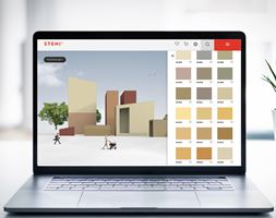
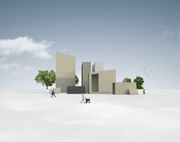
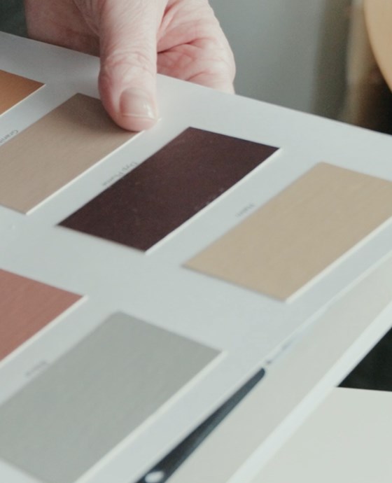
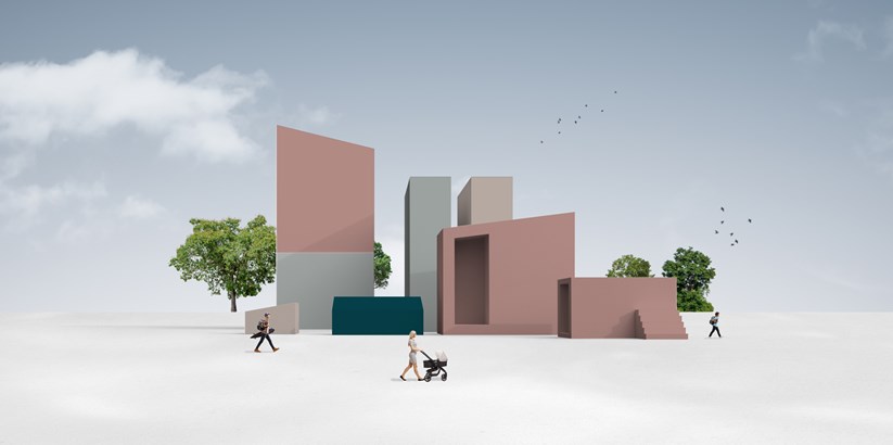
The new collection of Steni Colour consists of a total of 80 colours, 60 of them make up the base colours, but in the colour chart you will also find 10 accent colours and 10 in grayscale. In addition, you get the Steni Colour panels with different gloss levels. So here it is absolutely possible to play with colours.
Try the STENI Colour tool – a digital tool where you can test colours to find the perfect composition for your project.
The new colour map emphasizes cultural history and is based on combinations from the Baroque to modernism. Based on historical colours in urban areas, here we present a selection of hues and shades chosen to inspire creative expression. The colours aren't trendy, or made to keep up with fashion. These colors are timeless, honest, and full of meaning.
Kine Angelo, Associate Professor at NTNU, Department of Architecture and Technology has been working with colour for over 12 years. She has been part of the team for the development of the new colour collection:
"A common problem with products on the market today is that the colours available are often too colourful or too weak. Often I work on peeling these away, but in this project it has been good to work out a new colour map based on real needs. It's really nice to be able to publish a map where I can say "here are safe choices"."
Steni's Communications Manager Jan Terje Nielsen is also pleased with the new colour chart, which has received good words from the industry:
"We have had a fantastic collaboration with NTNU and Kine Angelo in the development of the collection. Our goal has been to produce colours that are applicable to the architects' needs and local colour guidance guides both in Scandinavia and internationally. The feedback we have received from architects who have looked at the collection has been overwhelmingly positive, so no doubt that Kine and NTNU know what they are doing."
We have had a conversation with Kine Angelo about colors in architecture and put together a video course in five episodes. Here you can see all the episodes collected:


We are affected by the colours around us
Since its inception, colour has helped us orient and understand our surroundings. If it becomes too much, we are overstimulated, but we can also be under stimulated by too little variation in the colours we surround ourselves with.
"Nowadays, we tend to spend more time in cities, or more urban areas, so colours in architecture will sometimes replace what we get from nature. Then we must consider that the variation we get in nature will also be on the buildings we surround ourselves with," says colour expert Kine Angelo.
Nowadays we tend to be more in cities, or more urban areas, so colour in architecture should sometimes replace what we get from nature. Then we have to consider that the variation we get in nature will also be on the buildings we surround ourselves with.Kine Angelo, Associate Professor NTNU, Department of Architecture and Technology

Kine Angelo
Especially in urban areas, too many buildings can be placed on the grey scale, which is not entirely fortunate. It is no coincidence that grey is often associated with negative emotions to describe nature, weather and mind, such as "grey and sad", "monotonous", "commune grey". We simply need colors to get joy and energy.
Physiologically speaking, there are also laws, such as universal design, that state that we must have contrasts and light. If the guidelines are not followed, the ability to see and orient oneself well is downgraded. In addition, the brain is "tricked" into thinking that we have little light, even if it is midday, and we feel inferior both physically and mentally.
Designed for place identities and proper use of colour in urban areas
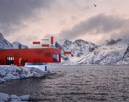
Colour is closely linked to place identity through history and materials, which in turn creates a mood. For example, Rome can be recognised by its warm, reddish hues, and Paris by its delicate, monotonous palette. In Norway, we have traditionally had access to other materials and often stronger colours.
We used to get pigments from the soil, minerals and nature through what materials were available. Whereas today's technology allows us to produce infinite hues and hues.
"Now that we're not as limited, we might want to have some rules of the road. We should play on the existing colours to preserve the identity from place to place. Try to be a good neighbour when choosing a colour, says Kine Angelo.
Not sure how best to combine the different colours? Take a look at Kine Angelo's façade colouring guide.
Mutual learning
The development of the colour map has taken place through a close and good collaboration between Kine Angelo and Steni, the ultimate combination of colour theory and technical know-how about façade panels. A fun and educational process, Kine Angelo thinks:
"There has been a lot of humour, but also a lot of openness in relation to the fact that we know different things, we are good in our own small field, then we come together and create something in common."
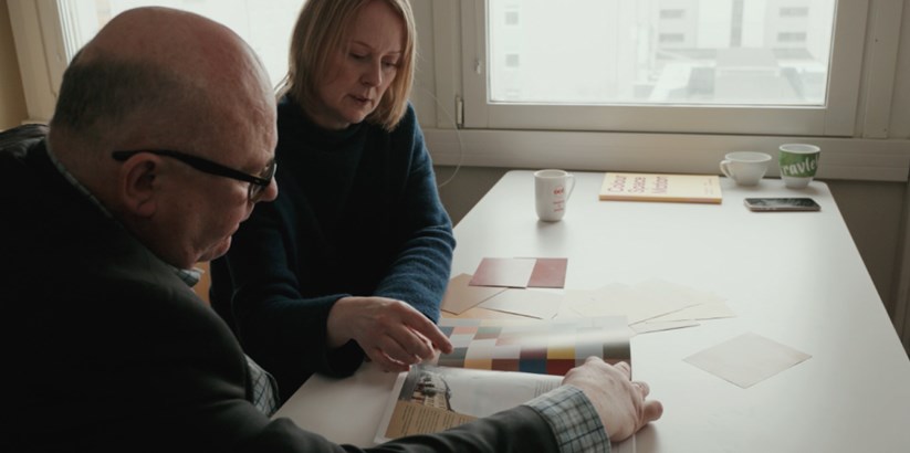
Jan Terje Nielsen and Kine Angelo have worked well together on the new colour chart.
Through the good cooperation, it has been ensured that the new collection with Steni Colour meets Steni's mandatory requirements for quality and durability, while at the same time arriving with a set of good colours to lift the architecture and surroundings.
"I have experienced Steni as very open, and that they have listened to my experience and expertise. I have also learned back through an insight into the production, where you understand the limitations, it sets and the considerations that must be taken", Angelo explains.
There has been a lot of humor, but also a lot of openness in relation to the fact that we know different things, we are good in our own small field, then we come together and create something in common.Kine Angelo, Associate Professor NTNU
FACTS
Quality and creativity
In order to achieve the optimal combination of colour range and quality of the façade panels, these are elements that have been taken into account when developing the new colour chart:
- What pigments do we have available?
- What gloss levels do we have? It can affect the color a lot.
- Fading: It should withstand standing for a long time.
- Sustainability: It must be a durable product.
- Other building elements, such as fittings.
- Should fit together with other architecture, in both traditional and modern colors.