


Rules for coloring façade and exterior
Facade colours are closely linked to place identity and help influence the surroundings and the people. Here you will find the colour expert's advice for colouring façades.
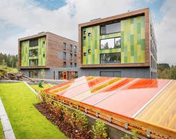
With STENI façade panels you have endless possibilities when it comes to façade expression, including natural surfaces at Steni Nature and printing at Steni Vision.
If you are going for our coloured façade panels Steni Colour, you have a colour chart consisting of 80 colours, 60 of these are basic colours, ten accent colours and ten in greyscale. In addition, you can choose between different gloss levels.
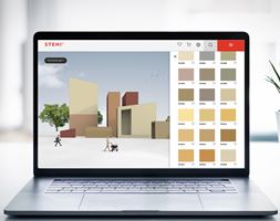
Try the STENI Colour tool – a digital tool where you can test colours to find the perfect composition for your project.
Of course, it's also fine to combine several colours, and to make it easier for you to find good, functional combinations, colour expert Kine Angelo has set up some rules of thumb for colouring façades.
Get to know Kine Angelo and the development of Steni's colour chart.
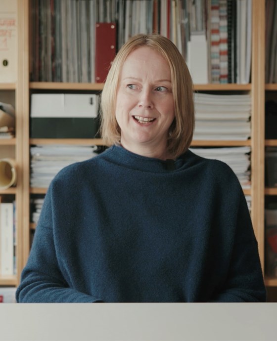
Kine Angelo, Associate Professor at NTNU, Department of Architecture and Technology.
Define colours
When you start finding good colour combinations, it is important to define what is the main colour, accent colour and contrasting colour. In our colour gallery you will find an overview of all the colours.
Main Colour
The colour that is on the largest wall surfaces in the façade, and which sets conditions for the other colours. The main colour should only be selected from the base colors in the colour swatch.
Accent Colour
The colours you find on smaller wall surfaces, building volumes and façade elements in the façade. The accent colours should harmoniously emphasize the hue tone of the main colour. You can use two accent colours, accent 1 can be used on smaller wall surfaces or larger building elements, while accent 2 can be used on small wall surfaces and smaller building elements.
Contrast Colour
The contrasting colour is the colour that pushes the harmony of the façade slightly out of balance. Like the accent colours, the contrasting colour should emphasize the main colour, but with the help of contrast. Contrasting colours are used on building details such as door, gate, framing, floor bands, décor elements, etc. The contrasting colour can be from the base colours or accent colours in the colour swatch.
The contrasting colour is usually the colour that creates the most contrast to the other colours in the façade, whether it is colour strength or lightness. It is the colour you want to be noticed, which activates the other colours and creates variation and excitement in the façade.
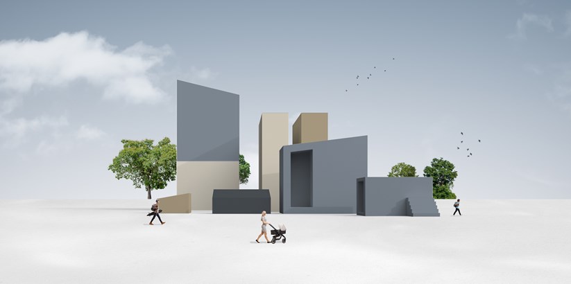
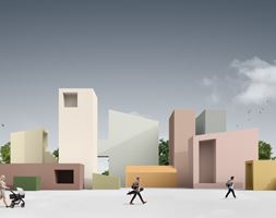
Example of color combination: SN9540, SN9520, SN9503, SN9510
Rules of thumb
Cultural-historical combinations
Since the new colour chart emphasizes a cultural-historical colour character, the colour palettes are
based on cultural-historical combinations (from the Baroque to Modernism) and in colours from the colour chart.
Material light
Based on the materiality of Steni's façade panels, the greatest emphasis is placed on the masonry architecture at source, as masons and painters largely used colour theory as a starting point for coloring of facades.
Contrast color on building elements
Building elements such as door and gate are laid under contrasting color. This is not directly
relevant to Steni and the abstract colour combinations you create, but if you want to state
"rules of thumb", it is important to include them.
Weighting
The other rules of thumb can be mentioned – weighting. The heaviest colour down and the lightest
colour upwards, principles of warm and cold colours, etc.
Colour combinations
The combinations can be rearranged somewhat; change the accent colours, which detail is contrast, or accent, and which one is the main colour and greater accent. Here I have generally thought proportions/ quantity ratio. I have also emphasized giving variety to the suggestions.
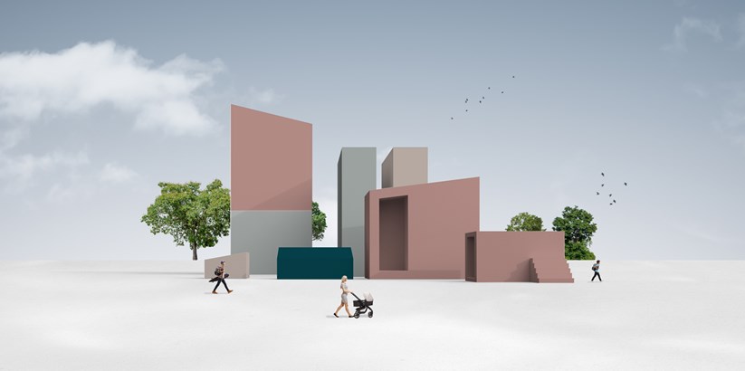
Example of color combination: SN9531, SN8661, SN9528, SN9303
Important clarification when experiencing colour
Keep in mind that all colours look different on a façade than they do on a screen or small swatches; colours will appear brighter and more vibrant, and colours in northern light will move in the direction of blue.
If you have found colours you want to test, you can order samples here.
FACTS
Combination of colours
- Main colour = main color façade wall
- Accent 1 = smaller wall surfaces/ larger building elements
- Accent 2 = small wall surfaces/ smaller building elements
- Contrast = building details; door, gate, framing, floor bands, décor elements etc.